


As a graphic designer, it’s all too tempting to simply rely solely on Photoshop and the digital effects that it can provide. The problem is: everything starts looking the same. Check out your local bookstore’s collection of recent novels, especially genre fiction, and you’ll see what seems like the same cover and colors over and over again. It’s also a problem in Hollywood, where the painstaking craftsmanship of Ray Harryhausen, the stop-motion genius who brought us the fighting skeletons of Jason and the Argonauts, has been replaced by weightless CGI that largely looks the same from movie to movie. So what do you do?
In working on cover design for novels, I’ve often had to make the choice between doing something digitally or seeing if I can use some form of practical effect or hand-drawn effect. When I can, I try to opt for something more handmade. The digital element is still there in each case, but the hand-crafted element grounds the design (I hope!) to make the cover feel more immediate and “real”. Here’s three novels that used some of those practical effects.
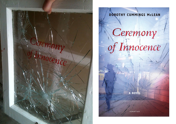
Ceremony of Innocence
For this cover, I wanted it to look as if you were seeing a scene reflected in a smashed window. I tried a few stock images, but they didn’t look right. Luckily, the building I work in had just done some renovation and I was able to save a window. The title of the book was painted backwards on the glass to keep it from chipping when I hit it. Then I whacked it a half-dozen times with a hammer wrapped in cloth. The result allows the title to meld much more with the cracked glass appearance than if I had tried to do the entire thing digitally. Other images were then overlaid on a photograph of the window to create the final cover image.
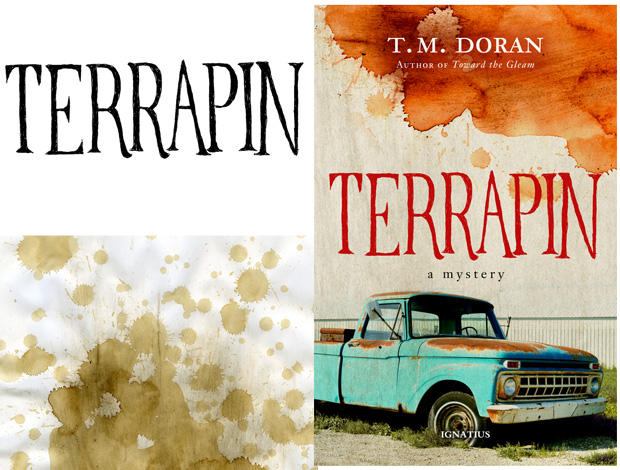
Terrapin
T.M. Doran is, like me, a huge fan of classic mystery novels. Terrapin is a mystery, but it’s not written in the classic mystery sense. So we talked about trying to capture a sense of that history of detective fiction, but with a more modern look. For the cover, I wanted to evoke the kind of hand-lettered dust-jackets of 1950s/1960s mystery novels, and so the lettering was based on a few I had on hand. The truck is central to the story. It took some searching to find a good photo. For the texture of the background, I took printer paper and smeared it with dirt and gravel. For the bloodstains, I made some extra strong coffee, dripped it from a height onto a couple of different pieces of paper. These were scanned and layered in Photoshop to make a single texture, and the coffee stains were altered to the blood color. Overall, the idea was to convey the idea of a nostalgic (but haunted) past and a murderous present.
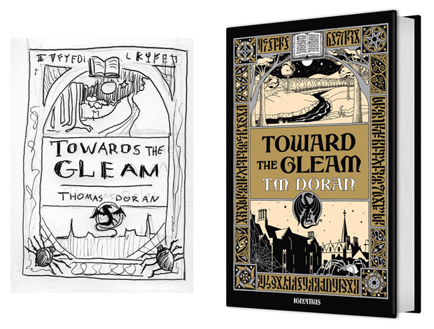
Toward the Gleam
Possibly the favorite of all the covers I’ve worked on, this one was based on the artwork of J.R.R. Tolkien himself—but not entirely. It had to look like it’s own animal, as you’ll realize if you read the book. I drew up a quick sketch and sent it to the immensely talented Daniel Mitsui, who created a stunning black and white cover drawing. I then created separate “plates” in Photoshop to be printed in metallic silver and metallic gold for the final cover. The end result is beautiful—and completely hand-lettered and drawn. (A side note here: Daniel Mitsui’s wife recently gave birth to their premature daughter who is in neonatal intensive care. You can drop by his site to purchase some of his art and help with medical expenses.)

About the cover art for SGNFP
October 18, 2013 at 1:57 pm
[…] Check out John’s latest blog post for Ignatius Press Novels, where he describes a few of the ingenious p… […]